Supercalligraphic

– In which Dorn misinterprets an Art Show.

I

 didn’t expect to be writing about art again so soon, but yesterday evening we went to an art show of one of Kathleen’s old friends from her days teaching at GWU, that turned out to be a lot of fun for me, and worth remarking about. 

It’s a two-person show called “Umbra” by Kathleen’s friend Becky Bafford and fellow sculptor Kini Collins, at the Horowitz Center at Howard County Community College.

As the title suggests, the show is about shadows, and every piece is created and displayed in a way that allowed its shadow to be part of the art. The pieces themselves are sculpture, so you have a nice three-dimensional foreground and two-dimensional light-dark background going on.

The show is also about “fossils, relics, and memories”, according to the brochure, and I thought it did a good job of evoking things past and gone. Many of the pieces are representative (or partly so) of objects found in nature, as the wall of chrysalis shapes above.

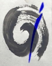
What I liked best were some shapes by Becky Bafford that triggered my delight response at two things I enjoy contemplating–(1) art that I don’t quite understand at a rational level, and (2) written languages that I don’t know. There were a series of shapes there that to me felt like they were three-dimensional calligraphy, spelling out a message I couldn’t quite grasp.

Looking at these shapes, it was possible to imagine the pushes, pulls, and gestures that went into forming each one. It was like watching one of those TV documentaries with a closeup of a Chinese national treasure slowly composing text in freehand chinese characters with a sumi brush, only with the added complexity that the character strokes all had depth, as well as width and height.

What a rich language that would be, that it had to be written in three dimensions! It was a conceit that really appealed to me, despite my suspicion that I had probably missed what the artist was envisioning when she created them.

The works by the two artists complement each other extremely well, both in mood and in the skill and subtlety of the use of surface and shadow. Moving from Ms Bafford’s room to Ms Collins’s, I was delighted to see another piece that reinforced my interpretation–there was a wall devoted to what looked the world to me like three-dimensional Babylonic cuneiform! (My photo doesn’t really do it justice.) The title of this piece was “Letters”, which makes me optimistic that maybe here I was even thinking along similar lines to the artist.

Even setting aside my personal twist on the work here, the show was a treat to see–the works are well made and artfully displayed, and evoked strong emotional reactions in the audience there. An evening well spent! Here’s the show info, if you find yourself near there with a few minutes to spend. The show runs until Sept 22.

Thanks,
Dorn
9/13/2019

It’s more an art than a science

– In which Dorn explores his interest in art, and artists.

K

athleen and I went to the National Gallery of Art last weekend, and saw two fantastic shows. One of them, The LIfe of Animals in Japanese Art, was (a) spectacular, and (b) over and done–Sunday was the last day. It’s going on tour to the Los Angeles County Museum of Art next, I think. We just noticed the “last chance to see it!” article in the Post this weekend and rushed over. It was totally worth it!

The other great show there, that we didn’t even know about till we got there, was of works by American painter Oliver Lee Jackson (b. 1935). It’s running for another month or so in the East Gallery.

Seeing these two totally different shows, one expected and one totally unexpected, reminded me about what I like about being married to Kathleen. There are many things, but the one I remembered specifically that day was that I like being married to an artist.

I was a bona fide scientist when I met Kathleen, and I figured I liked art, and life with an artist, because it was completely different from science, giving me a chance to experience a whole separate universe of experience. This was a contrast, I thought, with many scientists I knew who were married to other scientists, and so missed out on some of this diversity.

But over time I decided maybe the worlds of science and art aren’t so different after all. They both are endeavors to describe how the universe works and our place in it. They both have rules for how the process is to be conducted, and have widely agreed-upon conclusions that could nevertheless be changed or discarded over time as our understanding grew. The main difference (and it’s big one), as I saw it, is that science seeks to describe the world in ways that are independent of human biases and experiences, and therefore constant no matter who was measuring or experiencing them, where art seeks to describe the world in ways that are completely dependent on human biases and experiences, with all the chaos and unpredictability that brings.

On 9/11/2001, Kathleen was at work teaching at GWU in DC (across the street from the State Department, a viable possible secondary target) when the World Trade Center and Pentagon buildings were hit. During the days after that, she watched the news and analysis of the attack, and waited alone for me to get home from a Sea Grant meeting half way across the country, in a car because of the total ban on commercial flights. During the nights she painted.

She produced a still life from an apple we had in our fridge at the time, which she called “The big apple still shines”. It was a faithful rendition of the apple, but it was more–

'The big apple still shines', Kathleen Carlson, watercolor, 2001

The Big Apple, of course, is a nickname for New York, which was the meta-subject of the artwork. I don’t know how well this small picture does it justice (the original is almost two and a half feet wide), but the stem of the apple feels like it is descending into a shadowy vortex. The apple is sound, but dark and foreboding. When I first saw it, I could feel something starting to try to pull down the apple, make it less bright than it was.

This is what art does for me: it captures the human experience in ways that science cannot. The feeling of danger, both immanent and long-term, was pretty universal in America right after 9/11, and I feel Kathleen captured that, as well as a sense of resiliency, in “The big apple still shines”.

Other art doesn’t describe a galvanizing moment in history or an easily identifiable human thought or feeling, but I can still feel its power even if I know that most people might see something completely different. This happened with one of the paintings by Oliver Lee Jackson this weekend, which struck me deeply enough to want to try to write about art.

Oliver Lee Jackson, Painting (11.30.10), 2010, water-based paint and metallic enamel paint on canvas, courtesy of the artist. Photo M. Lee Fatherree. © Oliver Lee Jackson

This work is untitled, so I have no idea of the context of the painting. For me, it evoked a feeling of supernaturality. The blue figure on the right and the red one on the left seemed almost human to me, but dreamlike. But the black one in the middle really captured my imagination. In form, it was very like the other two figures, but it was completely unhuman, while still seeming (to me) to be very much alive. The picture made me feel like I was experiencing human and other spirits communicating together through a ritual dance.

I don’t know if what I saw bore any relationship to what the artist was trying to show. But that’s all right, because art is intended to be filtered through human experience, which is different for me, him, and everyone else.

I can feel the validity of the work even if I can’t begin to describe it in the scientific language I am more used to. And it’s the idea that I can feel the rightness of an artwork, or an artist, even if I can’t yet understand why it’s right, that keeps me coming back for more.

Thanks,
Dorn
8/21/2019

Following An Algorithm for Visual Harmony

Following an Algorithm for Visual Harmony

It wasn’t too long ago that I read an article by Iwo Zaniewski on social media that purported to explain an algorithm for visual harmony:

∀ei ∈ Sn C(ei, Sn\ei) = Cmax (Sn)

Now the article was long and since social media rather encourages short attention spans I just started skimming it. As an artist, I was interested to read enough to get what I think was the gist of it: For every element in your composition, you want to maximize the contrast between that and the other elements. Maybe this is where my recent interest in painting things with strong shadows came from. Anyway, in this latest painting I am working on, I am again exploring shadows and light. It was an interesting challenge painting the face completely in shadow, then adding the points of light. Two times during cherry blossom season I tried to get out there and paint them in person, but got rained out both times. So I’m working on this in the studio from a photo I took of beautiful granddaughter number two.